


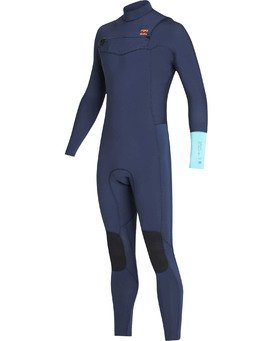
The sportswear company I chose was Billabong. I chose a surf brand because I know more about these companies and have bough from them for years. I would love to work for a company like Billabong in the future, so I thought it would be interesting to use their surf wear for the project. I always enjoy the patterns and colors they choose because they can be fun, but still professional enough for competing. Also, some of their patterns give off a vintage feel from the 80’s. I am very excited to work with this company for this project and I think my patterns and colors will go with what they put into their surf wear.
Greek Culture:


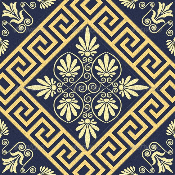


I chose Greek for my culture because the people that live there are very passionate about their country and their traditions. Greece is made up of 98% Orthodox Christians and they have many festivals that celebrate their religion. When it comes to dinner they have the whole family at the dinner table and they will spend hours eating and bonding with their loved ones. However, not all of Greece is the same. Each region has different Greek festivals and eat different foods. I also learned that most greeks are named after a religious saint and on their “name day” family and friends offer gifts and wishes. When it came to weaving the Ancient Greeks had a specific way of doing things. First, the women would clean the wool or flax fiber and break it down to prepare for spinning. Once the thread was spun it was threaded onto a loom and would be finished and sold or used for the women’s own homes. When looking at Greek patterns I noticed a very geometrical square shape throughout and there were also some flower aspects. When it came to color there was a bunch of blue and white. However, in Ancient culture it mostly brown and black due to the expensiveness of dyes.
Gloria Ging Gong:

- I changed my skin color to pink .
- Made my hair a platinum blonde (not the best photoshop job).
- I enlarged my eyes and tilted them.
- I made my forehead smaller.
- I enlarged my upper and lower lip and gave me a slight smile.
- I made the width of my nose smaller and I shortened it.
- I lastly made my eyebrows much thinner than they are.
Fashion Event Poster:

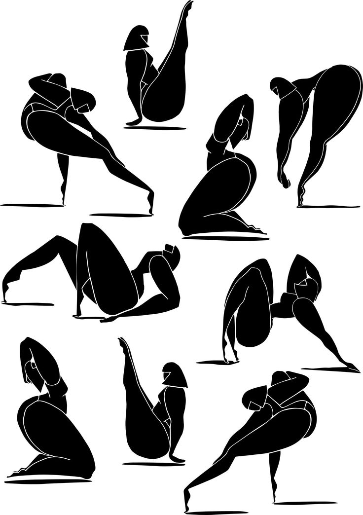


The poster I created is in the upper left corner. I made it a fashion show that’s inclusive to all women. Thats why I found some figures who do not look like every model. Also, the minimalistic style is in right now. The poster I looked off of is in the lower right hand corner and I know it doesn’t look much like it. I did use pink as the background and had black and white imagery. I used a upper left hand alignment on the name of the show and address and a lower right hand alignment on the date and time. There is repetition in the color of the text and Volcom logo. There is another color repetition in the black figures and the logo as well. The figures also have a center alignment. There is a contrast in the black figures and the bright pink background. I tried to give everything an even proximity from each other and tried to avoid open blank spaces or too much clutter.
Photoshop Practice 1:

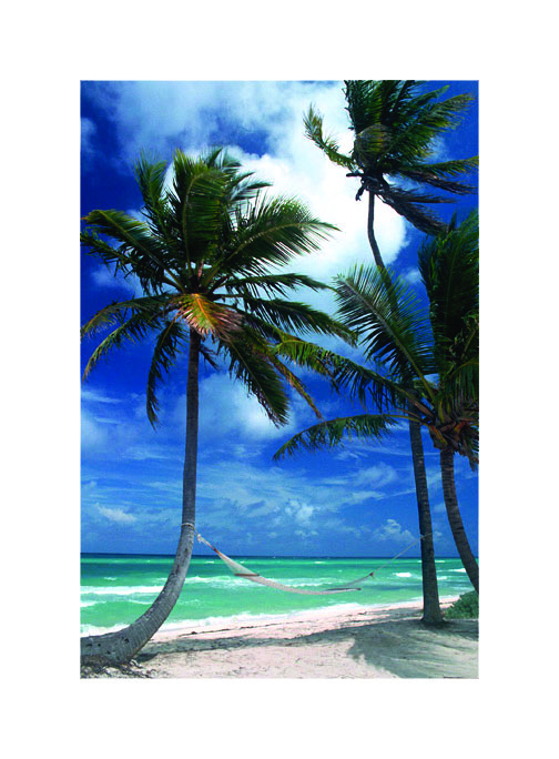
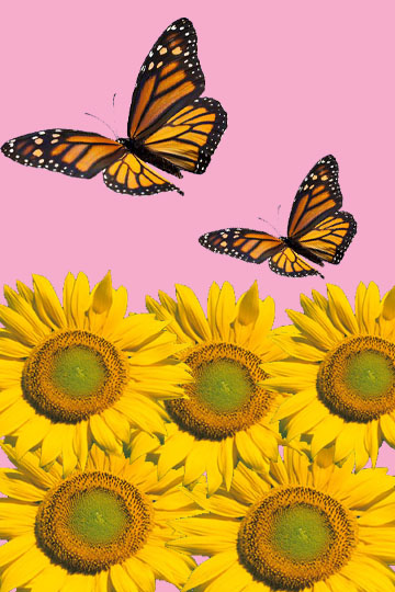
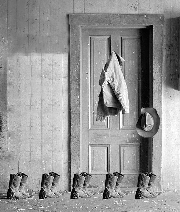
This past week in class we have been working on these four images in photoshop. It was really fun to learn some new techniques and pick up new skills. In the ducky photo I have duplicated the duck and made it smaller, then I added some lake water in the background to make it look like they were floating on top of the water. In the sunflower photo I added a pink background, two butterflies, and duplicated the sunflower to make a small “garden.” In the palm tree photo I added a white boarder and flipped the image horizontally. Lastly, in the ranch house photo I duplicated the boots four times, moved the coat to the door, put the hat on the door knob, and did my best to make the wall look as natural as possible.
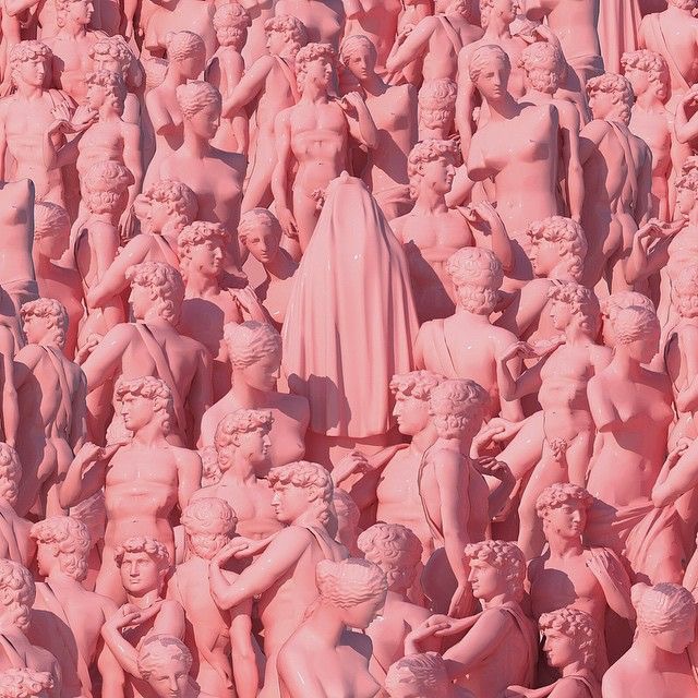
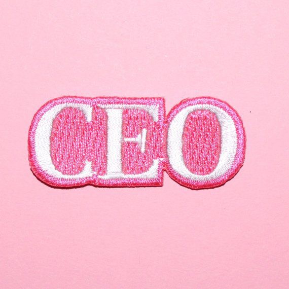
Pink, Pink, Pink!



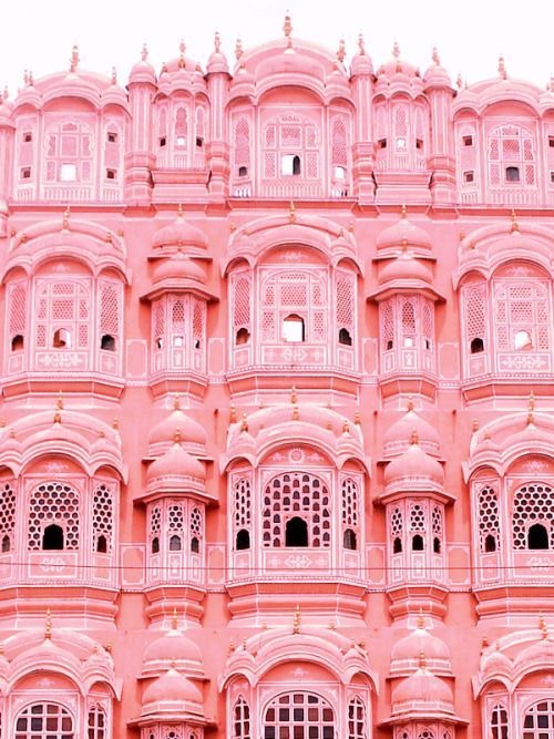


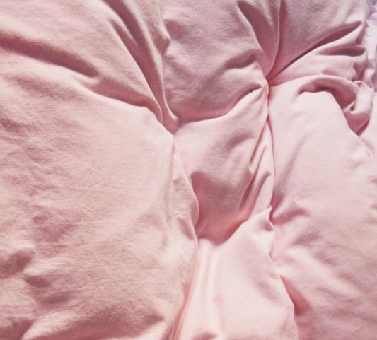
I chose a pink monochromatic color relationship. I chose pink because it is seen as a “girly” color and can have negative connotations. Within this collage of pink some of the photos have empowering messages like, “CEO” and “GRL PWR.” I also chose monochromatic because having every photo be the same color and different shades is very calming and satisfying. Pink can sometimes be seen as too intense or tacky. I wanted to choose photos that make people feel empowered and womanly.

