

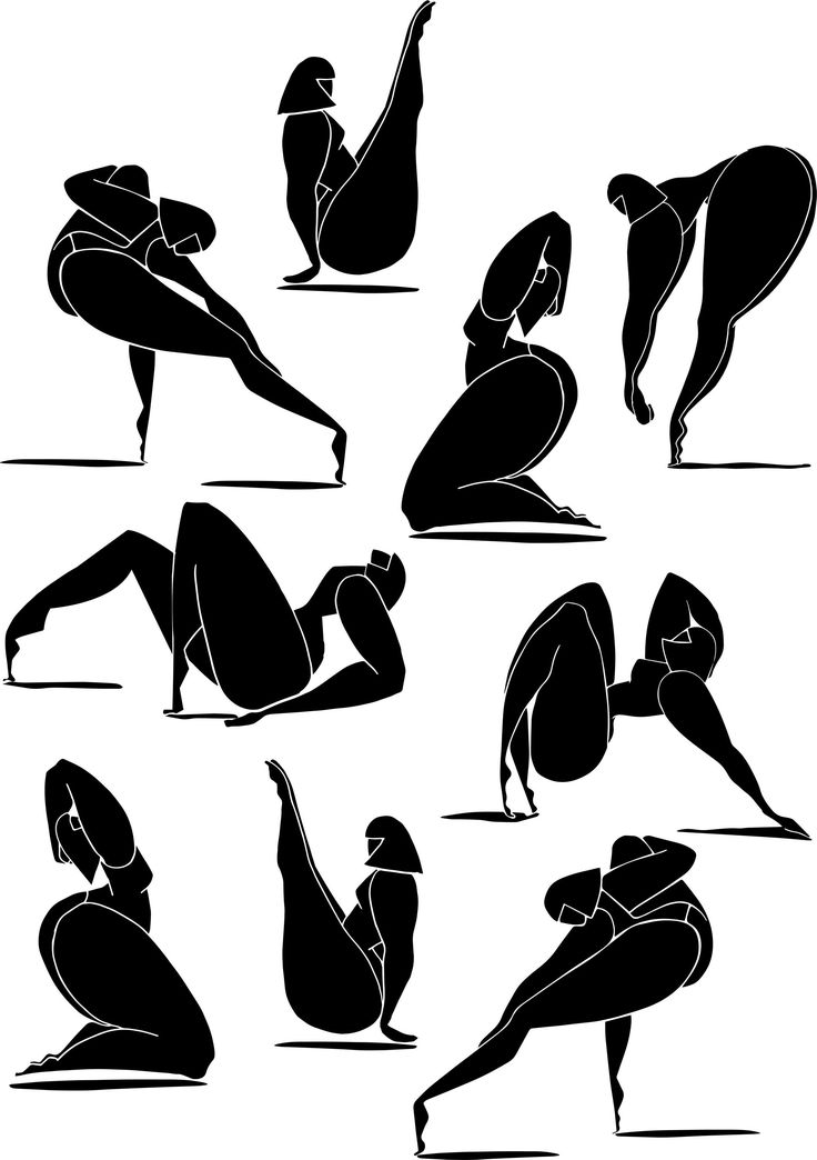


The poster I created is in the upper left corner. I made it a fashion show that’s inclusive to all women. Thats why I found some figures who do not look like every model. Also, the minimalistic style is in right now. The poster I looked off of is in the lower right hand corner and I know it doesn’t look much like it. I did use pink as the background and had black and white imagery. I used a upper left hand alignment on the name of the show and address and a lower right hand alignment on the date and time. There is repetition in the color of the text and Volcom logo. There is another color repetition in the black figures and the logo as well. The figures also have a center alignment. There is a contrast in the black figures and the bright pink background. I tried to give everything an even proximity from each other and tried to avoid open blank spaces or too much clutter.


Hi Alison – I think there are plenty of connective threads to make these feel related! The use of pink and then contrasting, graphic color in place of the geometric shapes. I want to be sure you understand the design principles though – remember, proximity is grouping with space used to denote the groups. You used it correctly but your description was less clear. Also, remember repetition and contrast are about more than color – so, repetition of font, contrast of type size, etc.
LikeLike